Bettina

Bettina owners Rachel Greenspan and Brendan Smith are on a mission to bring the finest pizza and naturally leavened breads to Santa Barbara County. Their restaurant is sunny and breezy in the day and glows with warmth in the evening, as guests enjoy a spritz and olives at the bar or laugh with friends at a table sharing a perfectly charred Neapolitan-style pizza.

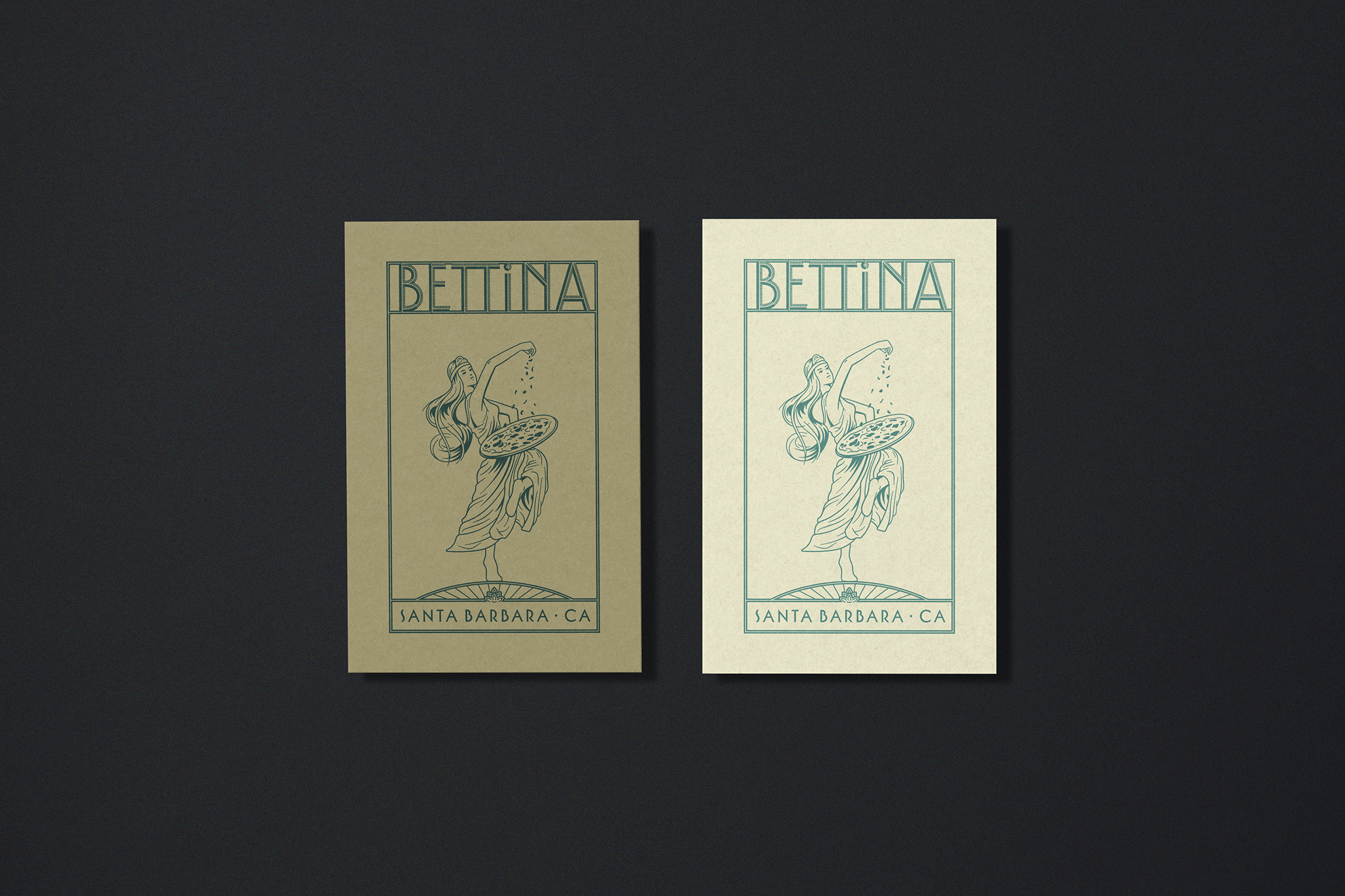
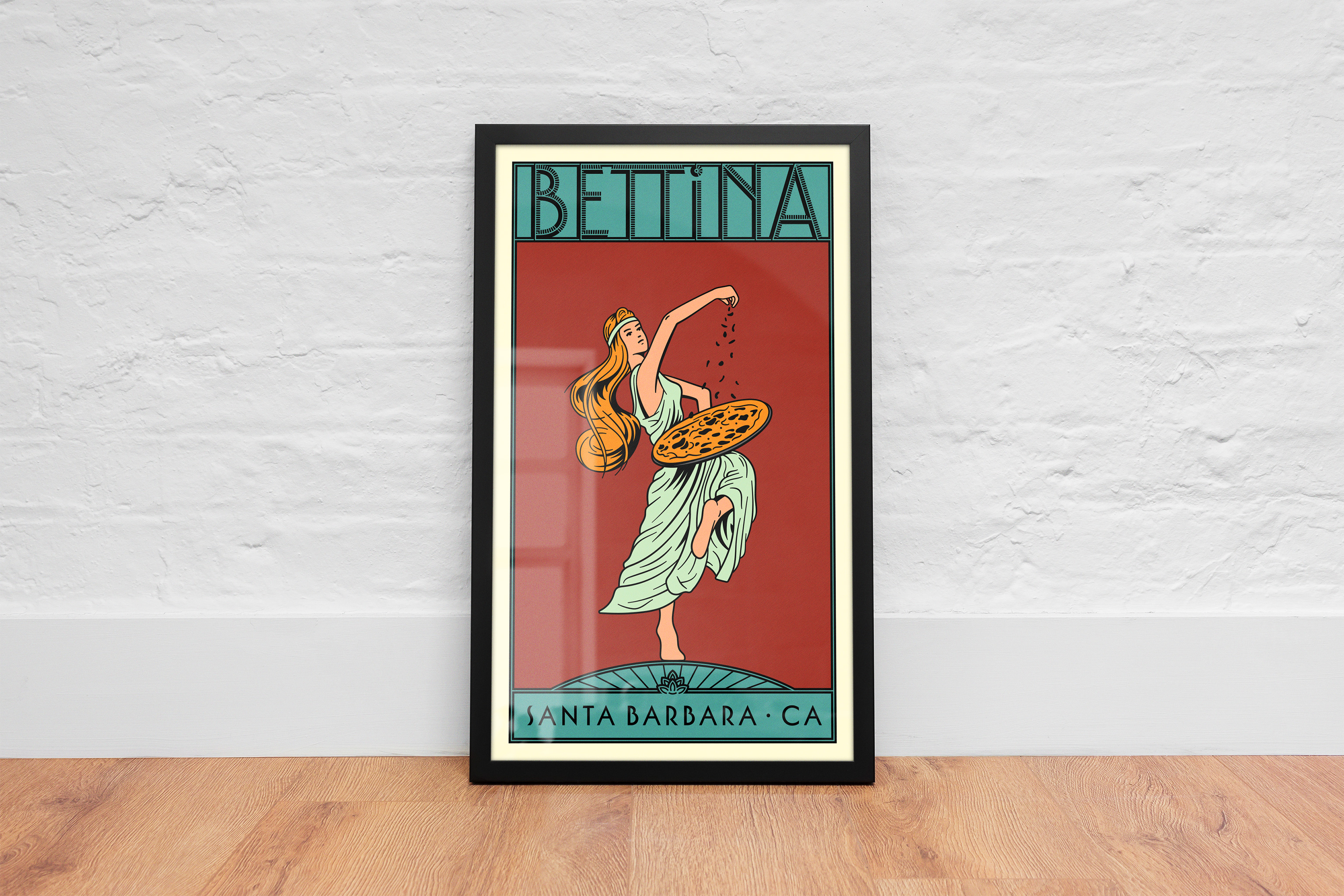
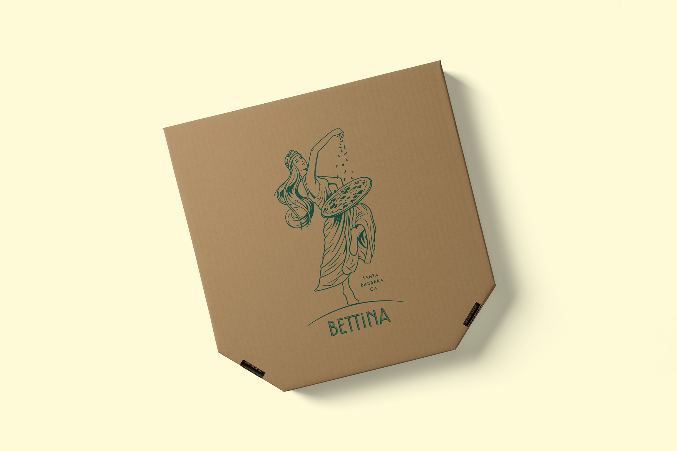
A holiday card we designed resonated with Rachel and Brendan, and they asked if we’d be interested in creating an illustration to use on apparel and other merchandise. The focal point of the Bettina identity, designed by Louise Fili, is an elegant wordmark. The two-tone type is reminiscent of mosaic tiles and the light and shadow interplay that often occurs in letterforms chiseled into stone. We knew that our task was to create an illustration that could sit perfectly with the existing wordmark.
Inspired by the Art Deco movement and Italian food packaging, we arrived at a goddess-like figure, twirling with a pizza in hand. In rounds of sketching and revising, we worked to capture her movement in an image that feels dynamic and full of life. The piece extends the restaurant’s vocabulary—it’s detailed, intriguing, and perhaps most importantly, fun.

Collaborators
Illustration Consulting: Reed Bradley