Jigsaw
Jigsaw is an interdisciplinary unit within Google that conducts research and develops technology to make the internet and our society safer. The team at Jigsaw builds tools to combat disinformation, censorship, harassment, and violent extremism. Jigsaw’s recent projects harness machine learning to identify toxic comments, help journalists to detect manipulated media, provide access to censored websites, and use targeted ads and videos to counter radicalization.
Images and video by Upperquad.
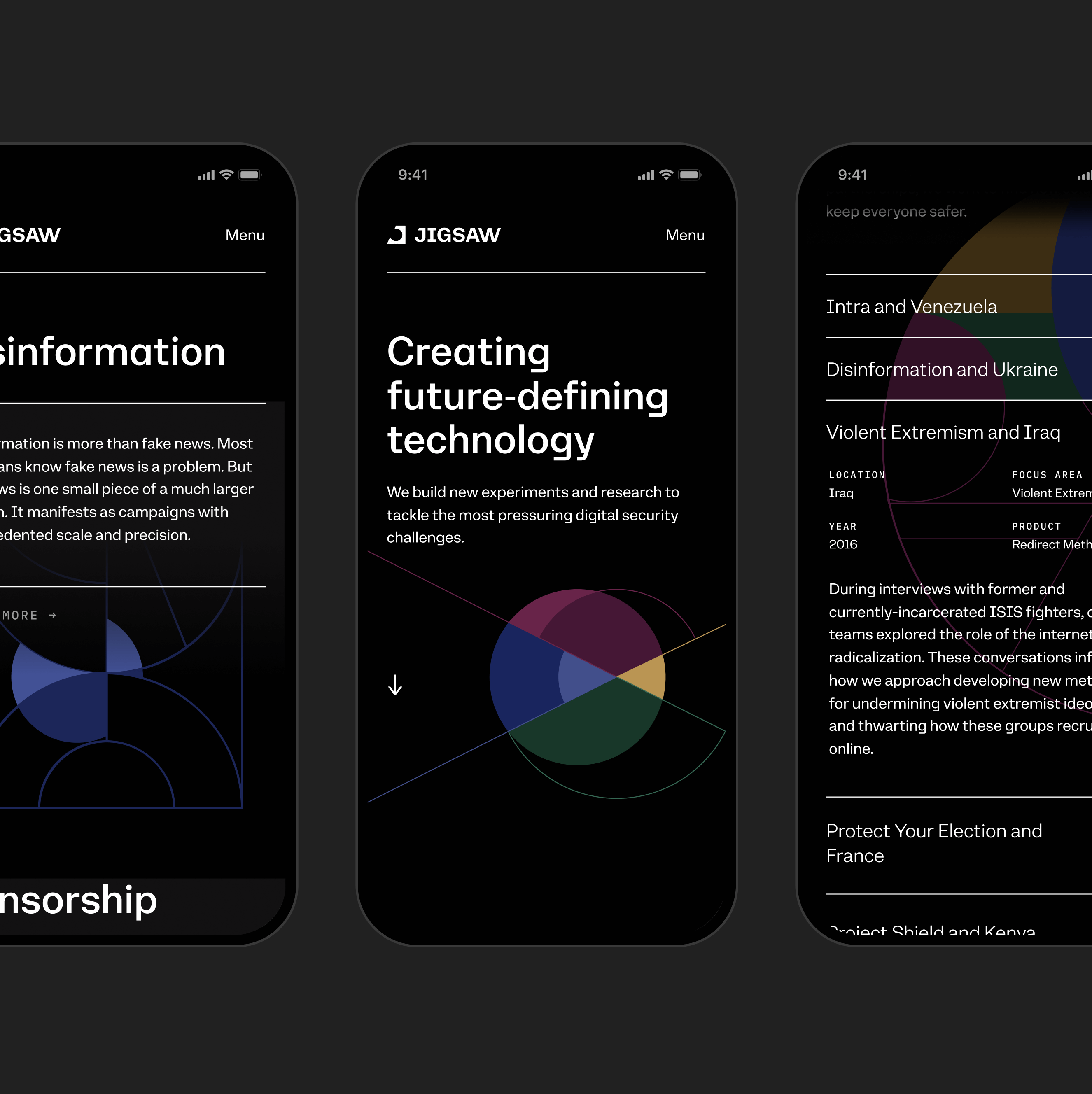
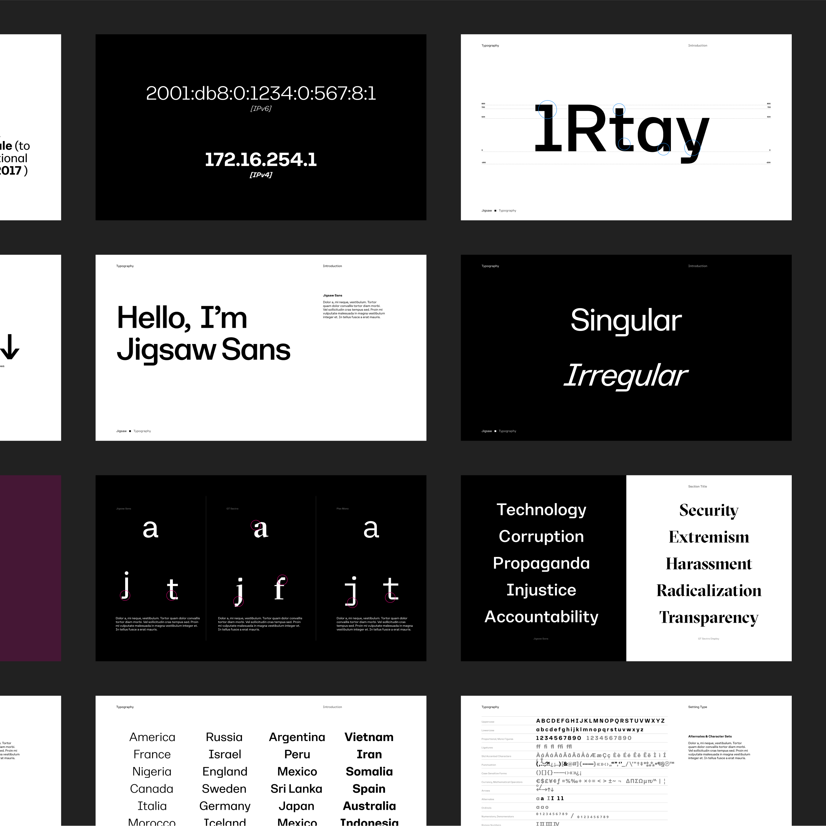
Upperquad, a San Francisco–based creative studio, redesigned the Jigsaw brand identity and built an entirely new digital presence for the company. As part of the new system, we created a custom type family called Jigsaw Sans. The family consists of four weights with italics, and can be used across a wide range of sizes.
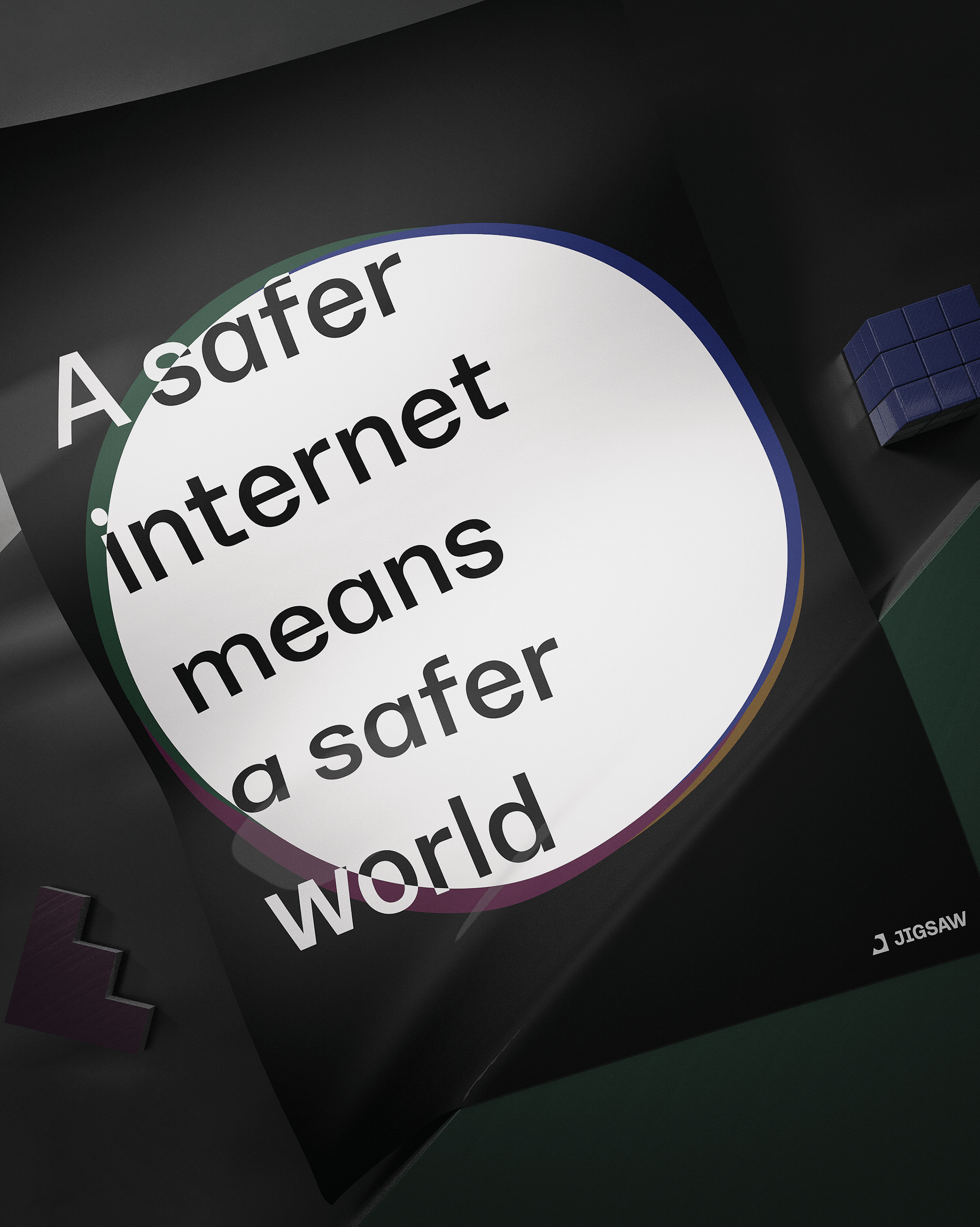
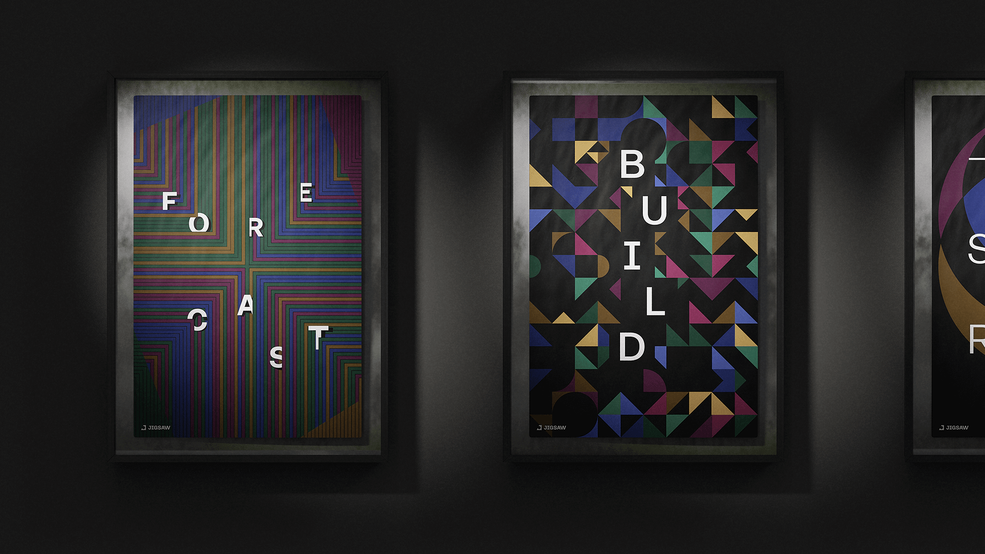
Jigsaw Sans draws on the medium contrast, closed apertures, and vertical proportions of mid-century sans serifs—Forma, in particular, was a key point of inspiration. The creation of the type family and the redesign of Jigsaw’s online presence took place side by side, the fonts evaluated and refined with each iteration of the website. Over the course of the process, we calibrated the weights to suit Jigsaw’s needs, refined the spacing and character widths for setting text on screen, added an alternate a for readability at small sizes, and increased the italic angle to a noticeable 18° so that the slanted styles could take on a more expressive role.
We also helped to design the updated Jigsaw wordmark based on the bold style of Jigsaw Sans. From the logo to the text on the website, the new type family creates consistency across every brand touchpoint, reflecting the balance between Jigsaw’s human and digital sides.
Collaborators
Direction: Jason Dietrick & Antonio Mondragon
Manufacturing: Ben Kiel
