Rippling
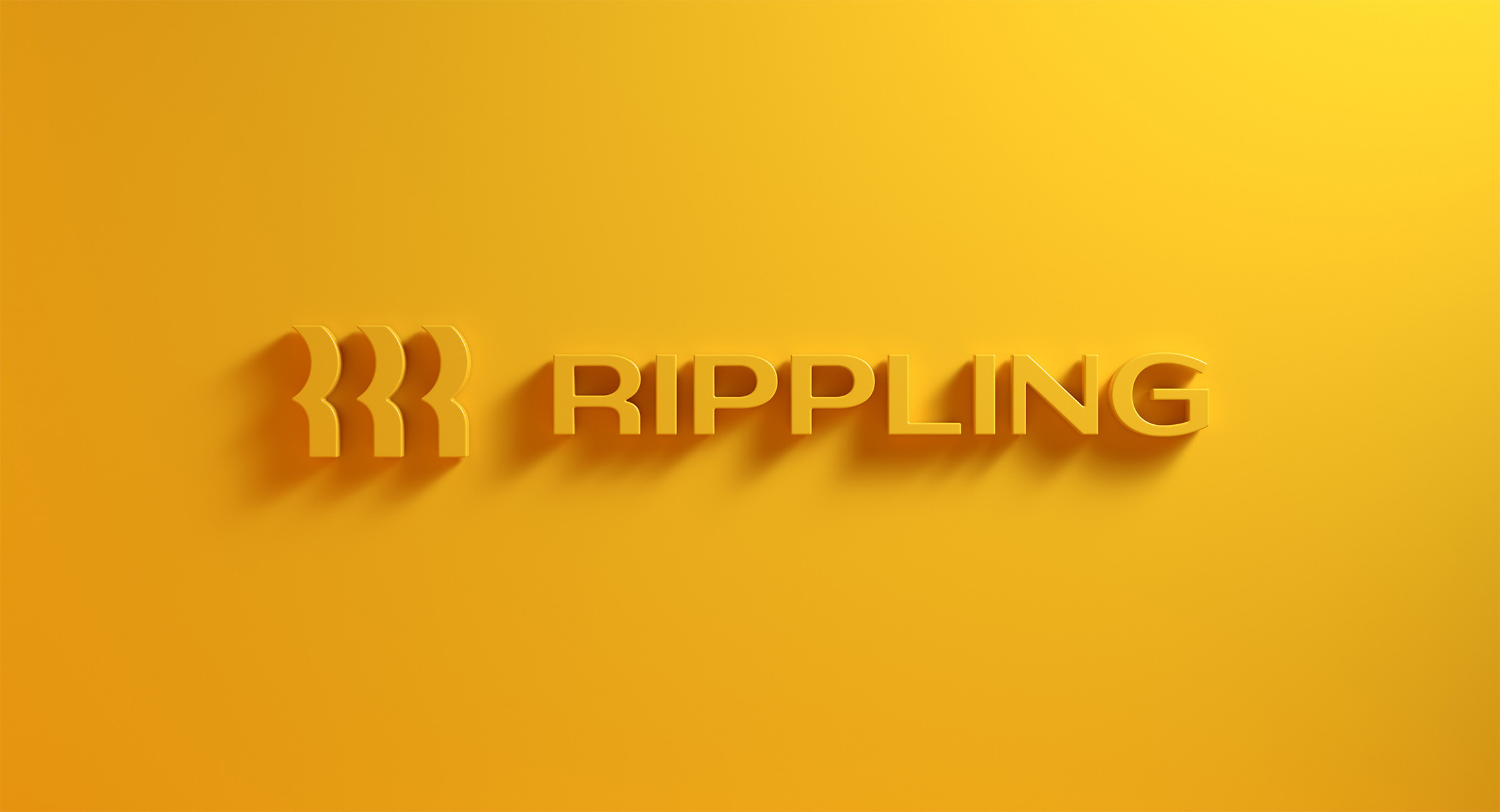
Rippling unifies HR, IT, and finance to give companies a single system for managing payroll, benefits, devices, apps, etc. We worked with the in-house team at Rippling and Play on the typographic components of company’s identity. The main logo combines an icon and a wordmark. The icon is both an R monogram, a ripple, and people, and the type is a wide sans with a healthy amount of contrast, a distinctive and unique choice for a technology company.

Images by Play.
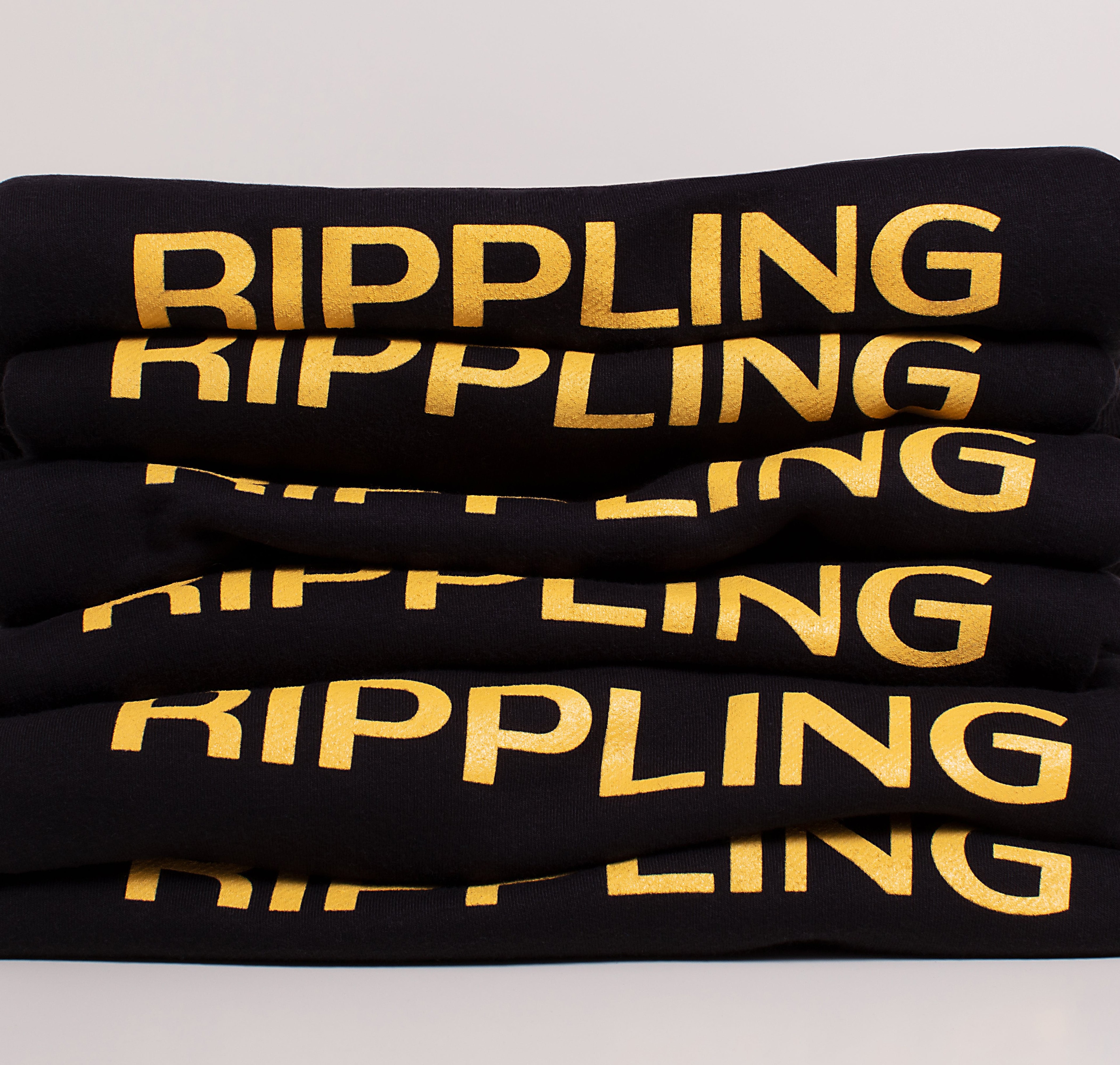
We also designed a custom typeface for Rippling based on the wordmark. Rippling Sans is a variable font stretching from an extra narrow proportion to the wide proportion of the wordmark, and from upright to italic. The typeface was initially created for the Work Magic campaign, a series of advertisements executed across digital content, video, billboards, trains, bus shelters, and many other placements across the country.
Animation by Rob Stenson.
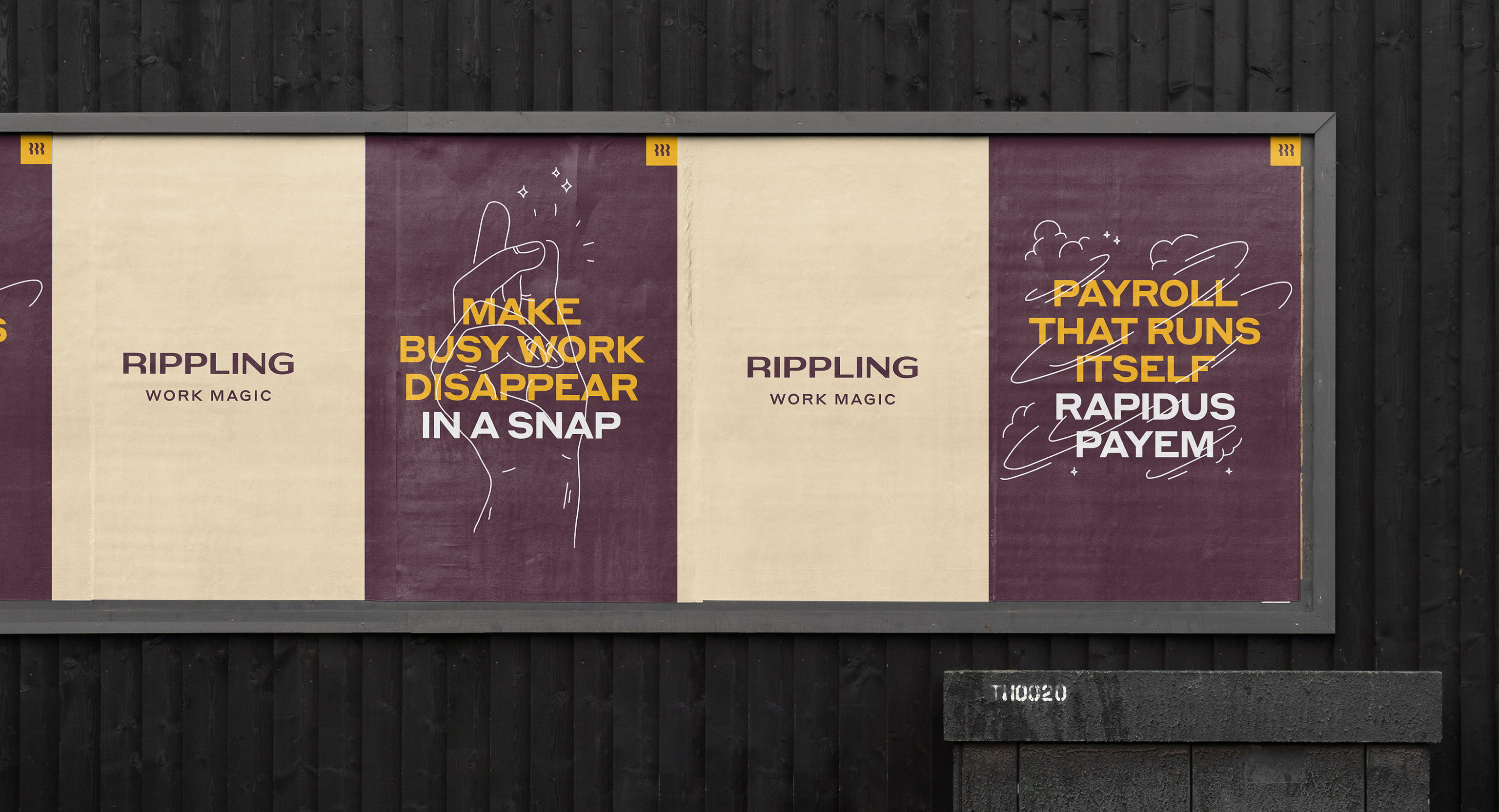
One of the concepts behind the Work Magic campaign was the expressive lettering on magic posters. Rippling Sans allowed the design team to create a wide variety of compositions mixing different widths and slants of the typeface, harnessing the full potential of variable font technology. The font can also come to life through animation, dancing, twisting, and showing off in all kinds of ways.
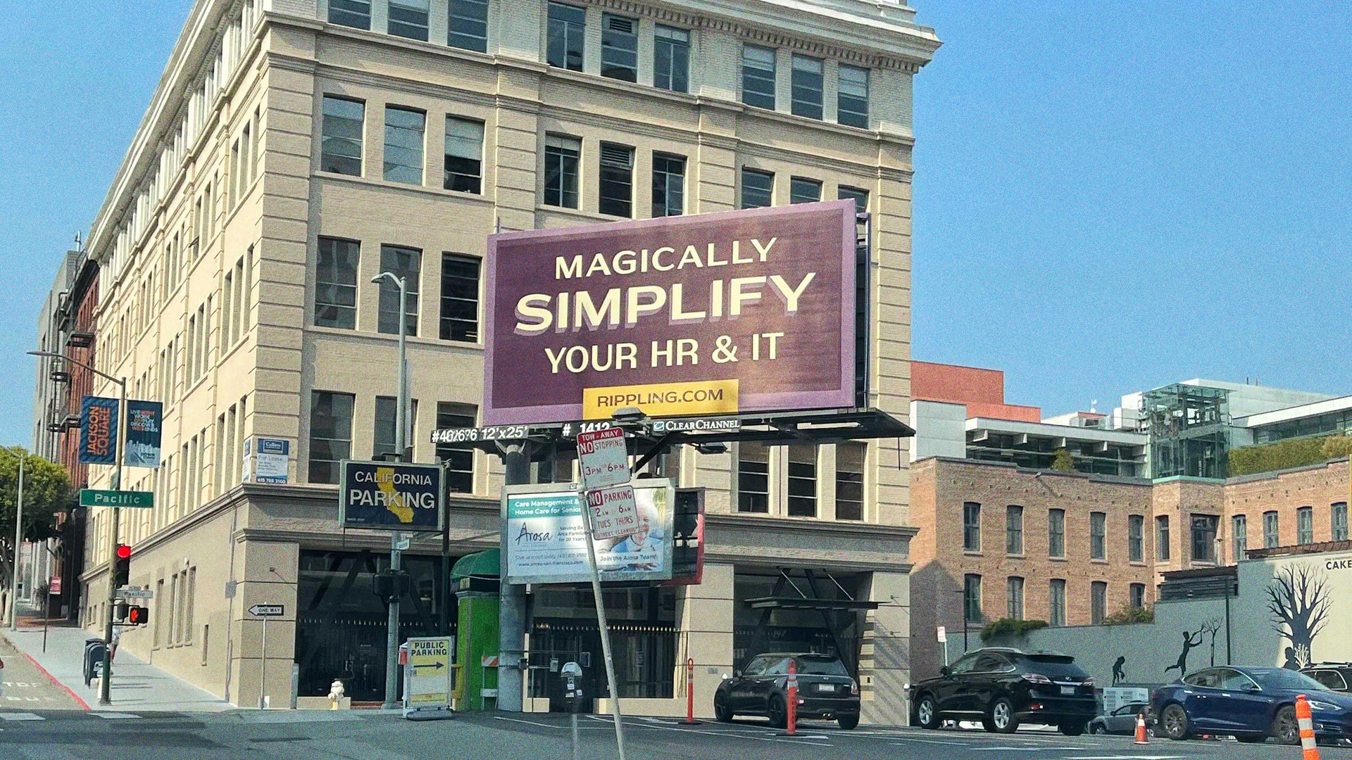
Work Magic ads in San Francisco.
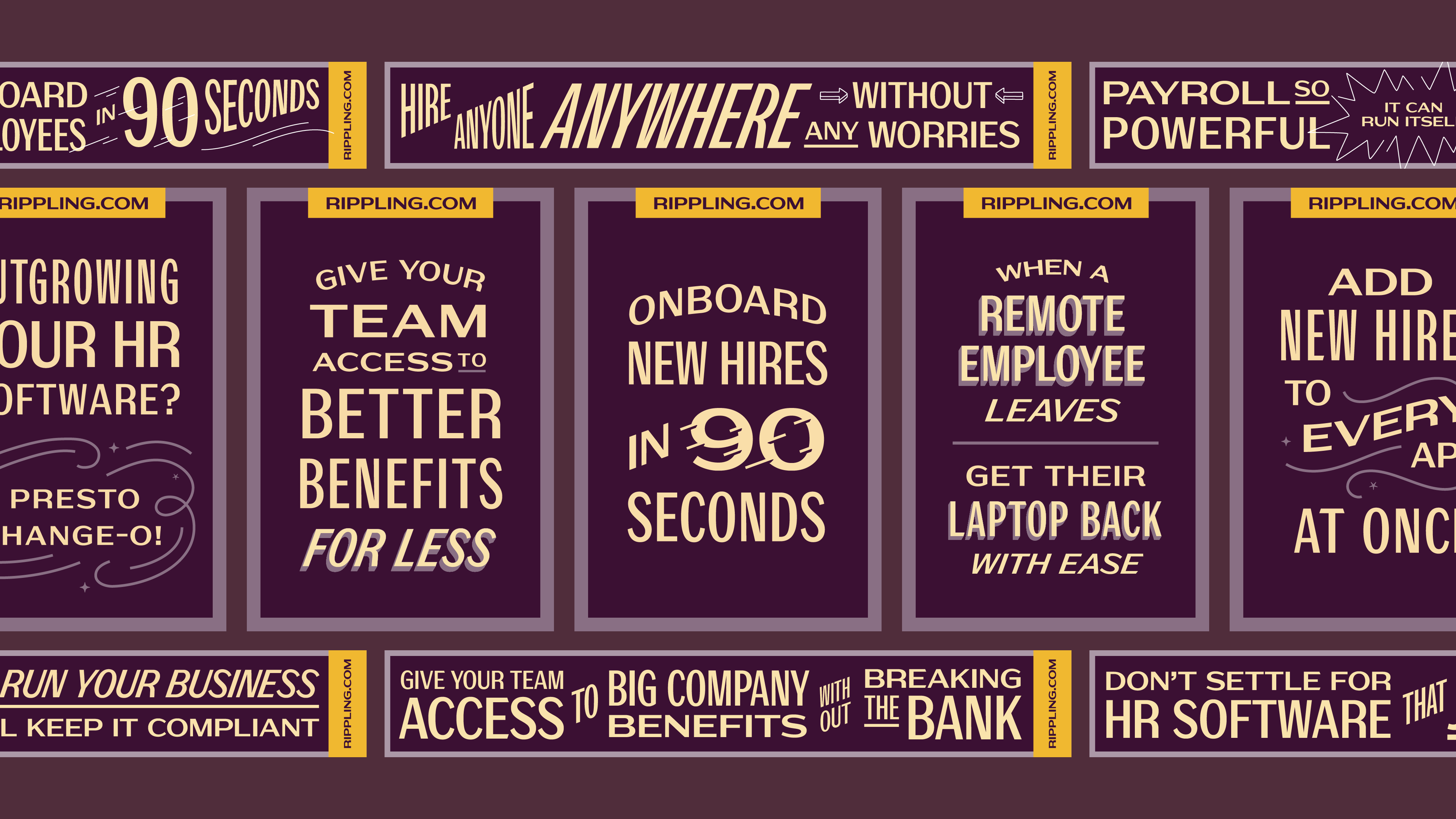
The Rippling Sans variable font made countless layouts possible.
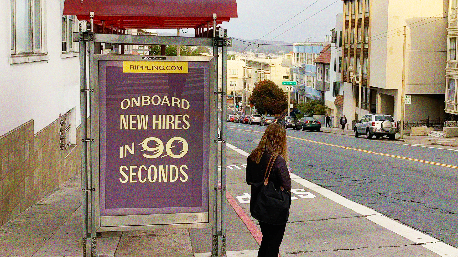
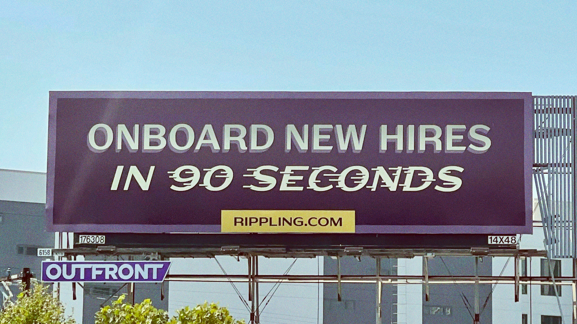
Over the years our collaboration with the Rippling team has continued, and we’ve also created expressive lettering for events and internal conferences. These pieces leverage some of the work we’ve done on the core typographic system, but embrace different styles of type in the process, creating moments that feel special while still at home with the Rippling identity.
Collaborators
Direction: Nick Weisner
Work Magic Concepting: Frances MacLeod
Type Production: Libbie Bischoff
