San Francisco Opera
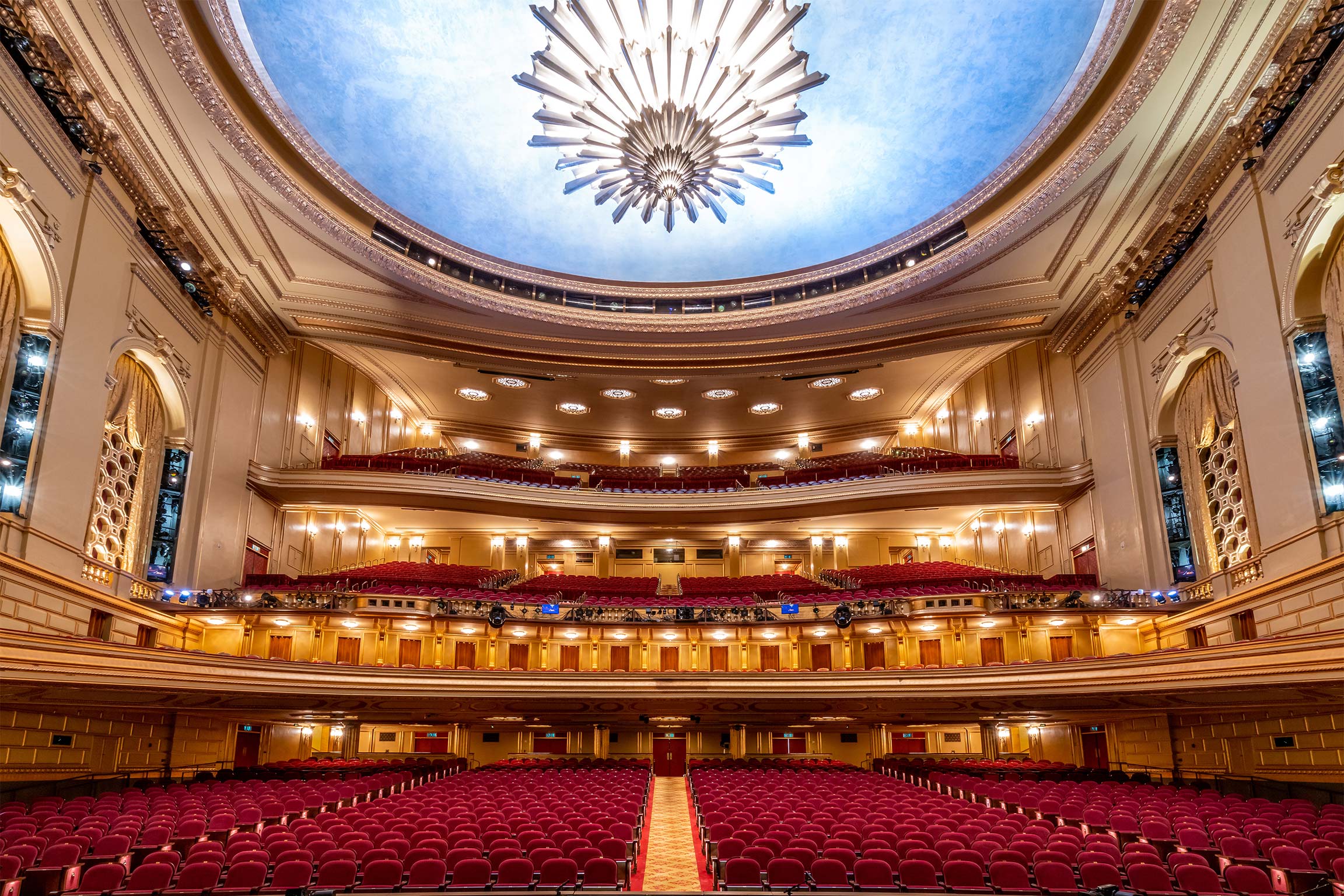
Photo by Steven Bullock.

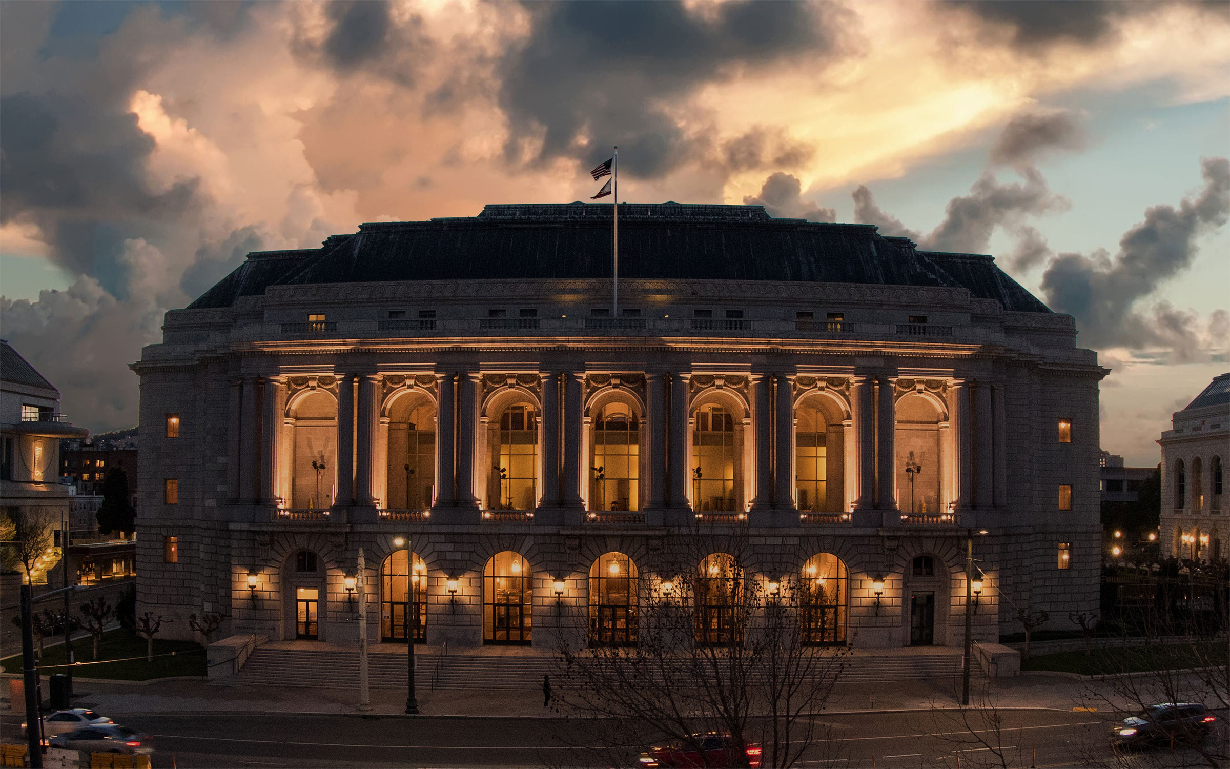
Photo by John Boatright.
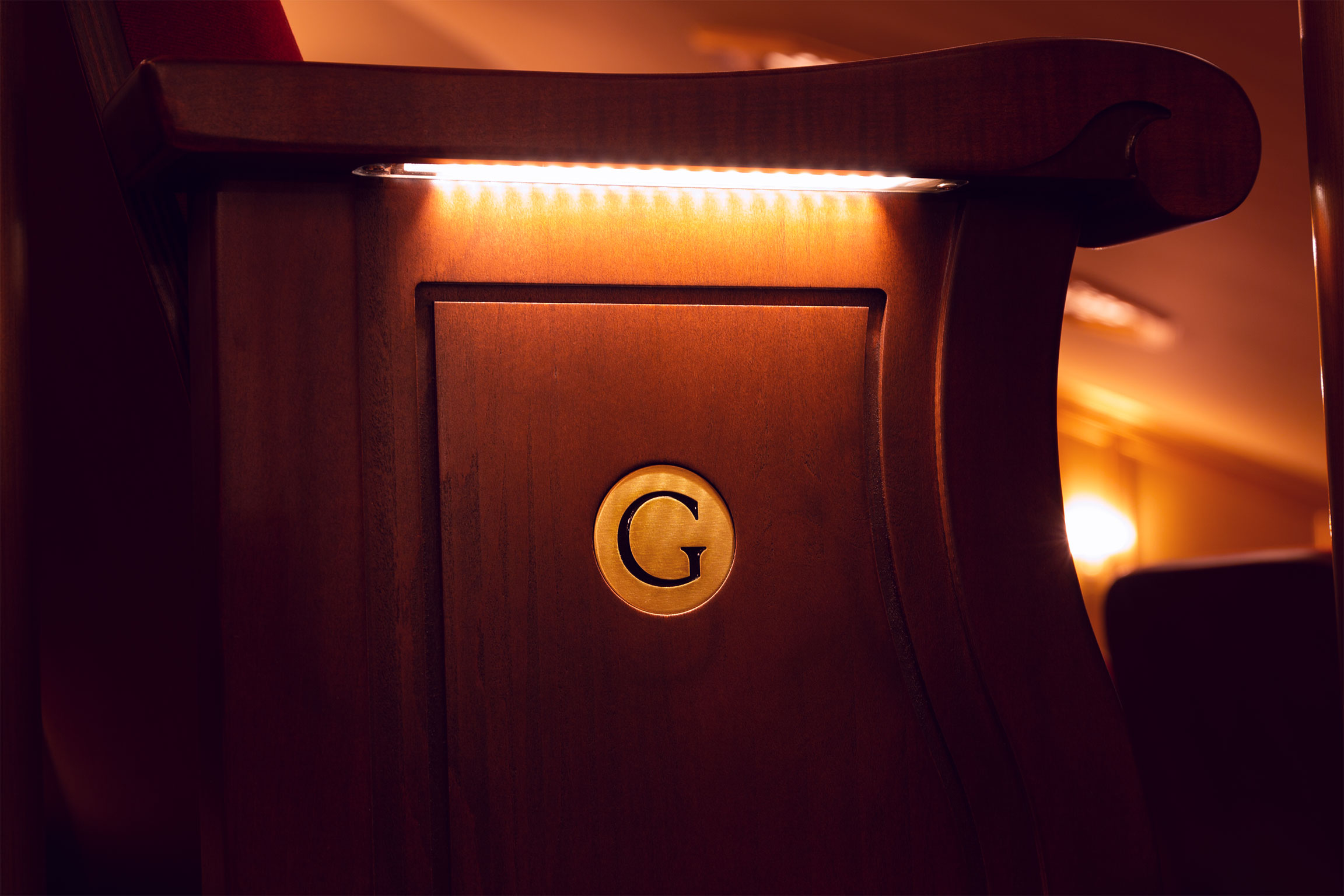
During the covid pandemic, the San Francisco War Memorial Opera House, home of the San Francisco Opera and the San Francisco Ballet, replaced all of its seating. We were thrilled to create a set of letters for the new seats. The alphabet we designed is carved into and out of metal throughout the opera house, helping patrons make their way.
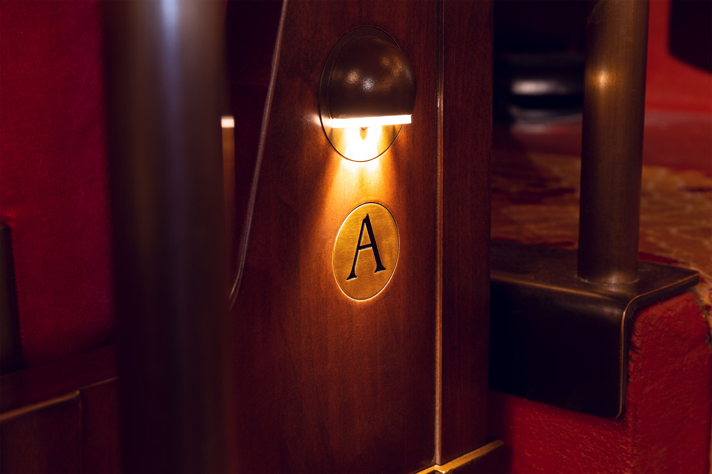
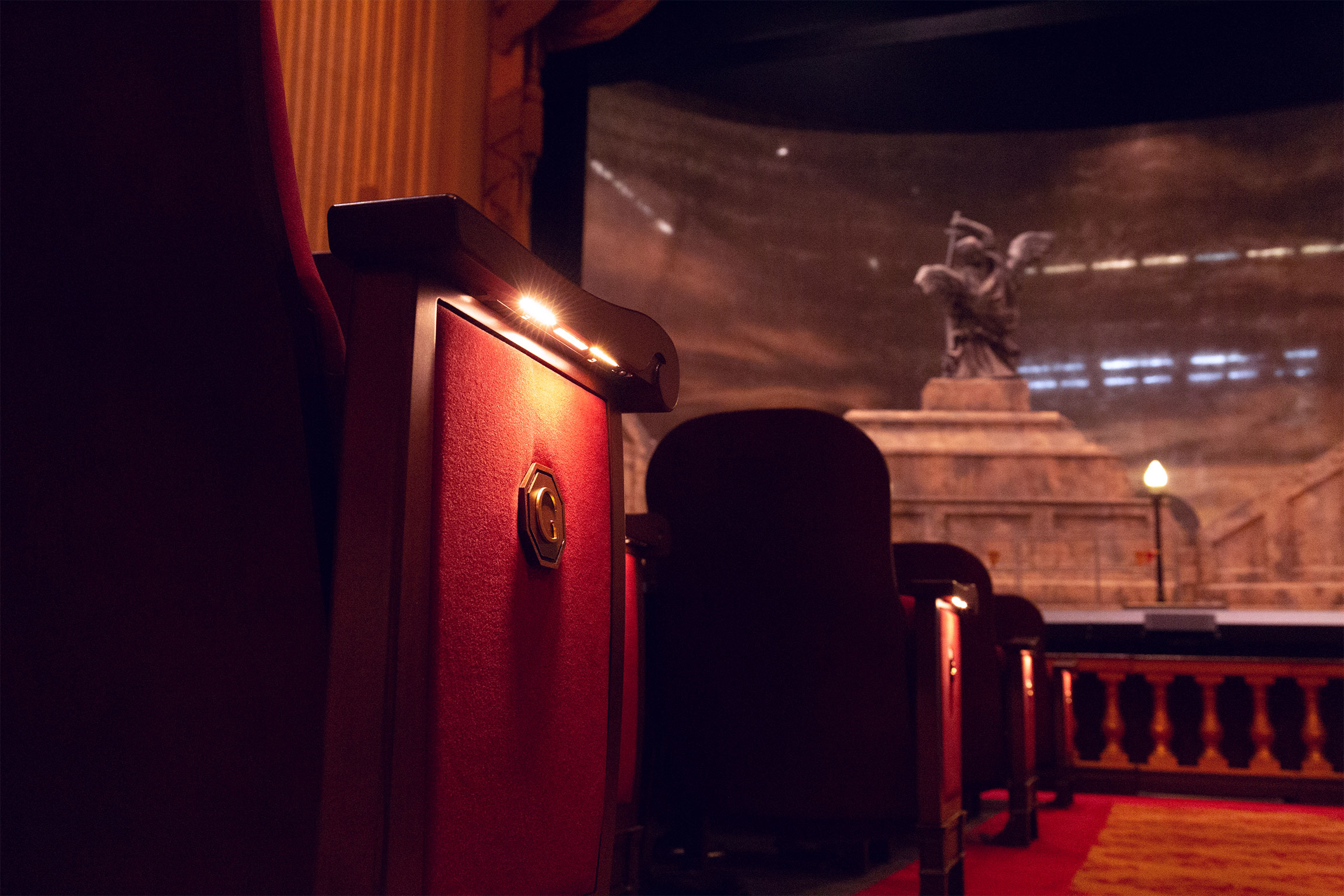
We based our work on existing letters in the building, specifically the box seat markers. As we started digging into the history of the opera house with managing director John Caldon, we quickly realized that there were two sets of letterforms used to designate the box seats. One was original to the building, and the other was a digital font chosen as a placeholder after a fire destroyed a big swath of the opera house in 1996. We decided to focus our attention on the original designs, which were elegant and architectural with sharp serifs, a great fit for the task at hand.

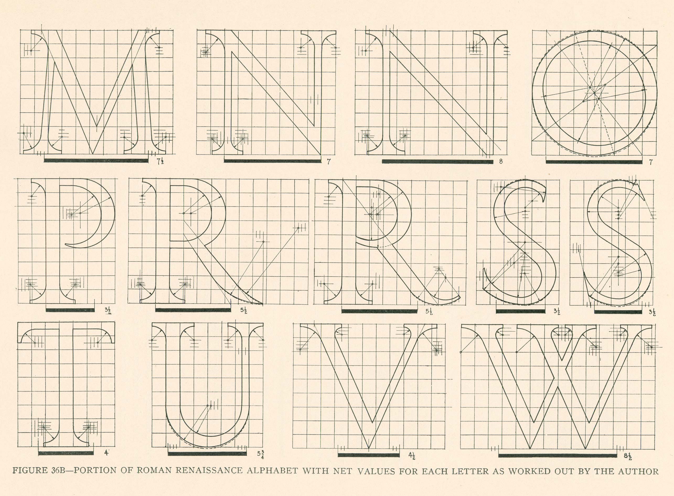
Wanting to track down the exact origin of these letters, we asked Stephen Coles, Editorial Director and Associate Curator at Letterform Archive in San Francisco, if he had any leads. He brought us the work of Egon Weiss, who created alphabets that could be replicated using geometry so that architects could use them in buildings without having lettering or calligraphy knowledge. It was a near a perfect match to the originals as one could hope for. It’s likely that the maker of the box seat markers was referring to Egon Weiss’s diagrams or something very similar. We’ve always had a soft spot for this kind of letterform - based on handmade shapes and analog tools, but abstracted into geometric formulas.
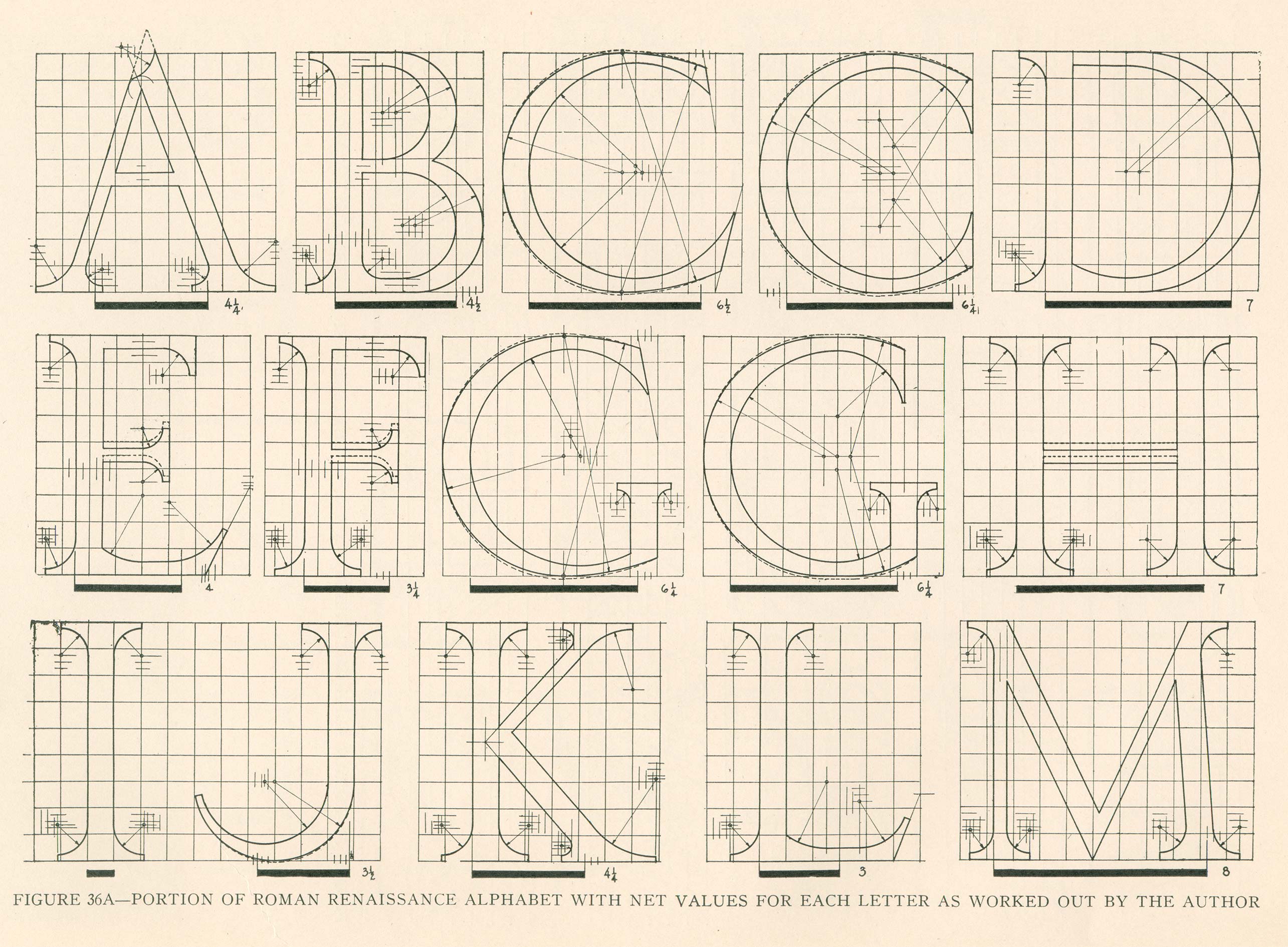
Egon Weiss, The Design of Lettering, 1932
We stayed true to the source material, both from the opera house and from Weiss, as we created this set of inscription so capitals, but we also fine-tuned proportions here and there and added a level of consistency that one would expect in a contemporary typeface. When you head to the opera or ballet in San Francisco, you’ll be using our type to find your seat!
Collaborators
Direction: John Caldon
Research: Stephen Coles